Studio Secrets of Pop Art Reloaded


Quiz Complete!
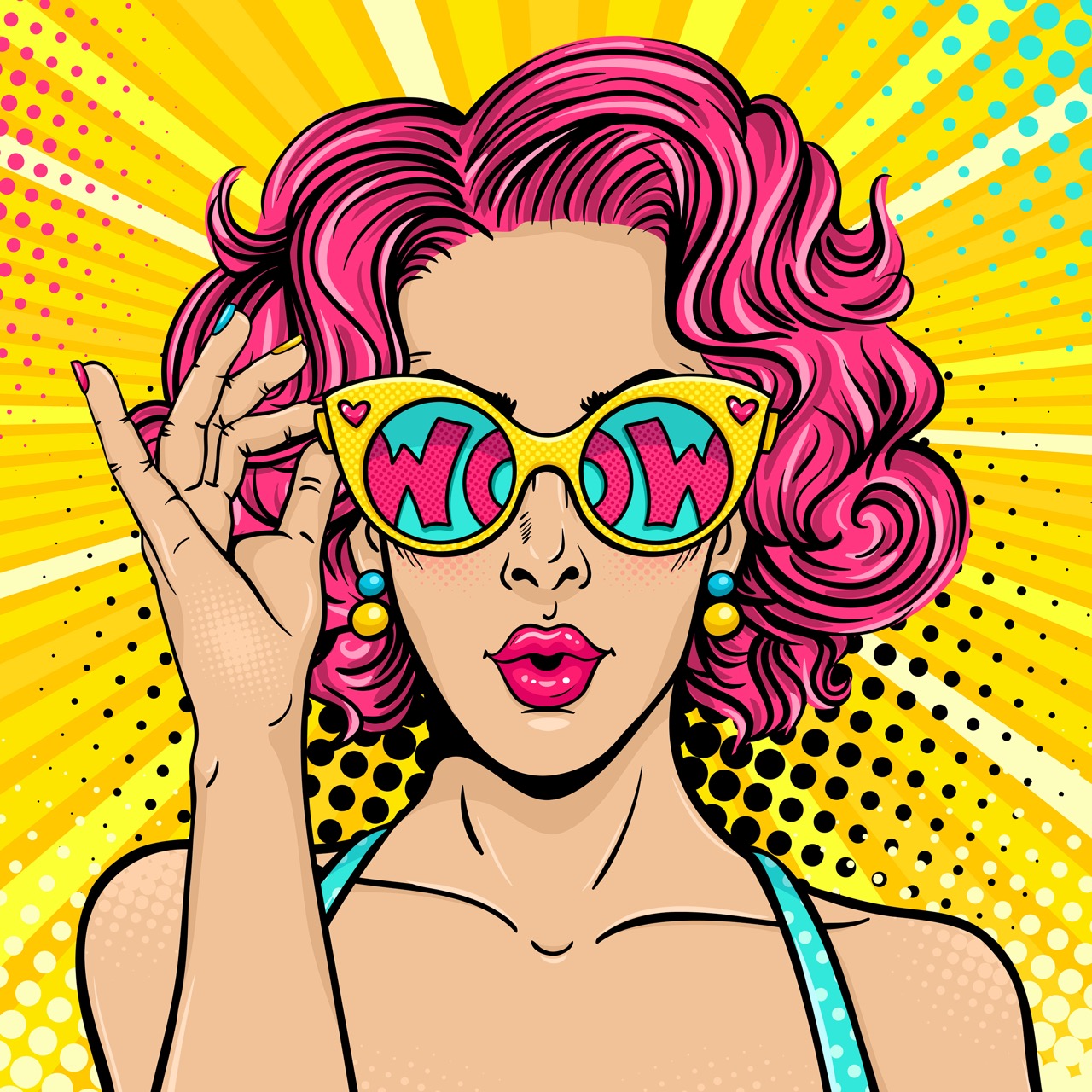
Studio Secrets Behind Pop Art’s Loud Look
Pop Art may look like it was designed to be understood in a single glance, but that instant impact was often engineered through careful studio decisions borrowed from advertising, packaging, and mass printing. Many Pop artists were fascinated by the way images reached people in everyday life: on supermarket shelves, in newspaper photos, on billboards, and in comic strips. Instead of hiding those sources, they leaned into them, adopting the same methods that made commercial images clear, repeatable, and fast to produce.
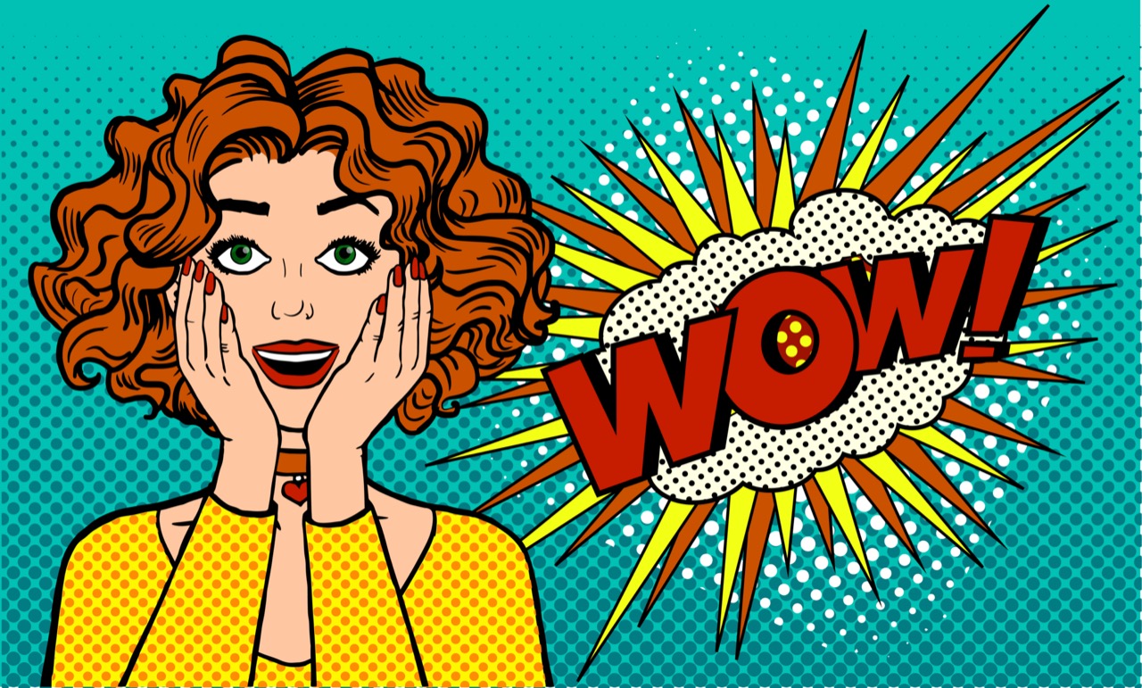
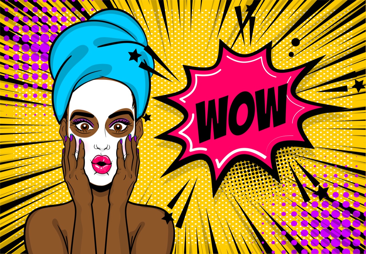
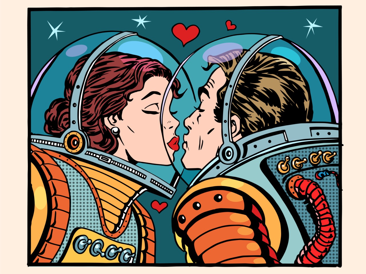
One of the most important behind the scenes influences was the printing world’s love of simplification. In commercial work, flat areas of color reproduce reliably and read well from a distance. Pop artists translated that logic into painting and printmaking, choosing hard edges and limited palettes not because they lacked subtlety, but because they wanted the authority and immediacy of a printed image. The famous dots associated with comic art, often called Ben-Day dots, came from a practical solution in cheap printing: tiny dots of ink that create shades and secondary colors when seen from afar. When artists enlarged those dots, what had been a cost-saving technique became a bold visual signature. The dots also carried a message about mediation: you are not seeing reality, you are seeing a reproduction of a reproduction.
Silkscreen, also known as screen printing, became a defining Pop tool for similar reasons. It allowed an image to be transferred through a mesh screen onto paper or canvas, one color at a time. That layered process makes it easy to repeat an image with variations, and it naturally produces small quirks: a slight misregistration where colors don’t line up perfectly, a patch where ink floods a little heavier, or a faint ghost of the previous pull. In a commercial shop those would be defects. In Pop Art they could become proof of touch, time, and production. Some artists embraced the accidents, letting the process show. Others controlled them, deciding exactly how much imperfection would feel alive without looking sloppy.
The studio itself mattered. A famous example is Andy Warhol’s Factory, which functioned less like a solitary painter’s room and more like a production space. Assistants helped prepare screens, mix inks, and pull prints, which matched Pop Art’s interest in the assembly line and the idea that images could be manufactured. This also helped meet deadlines for exhibitions and portfolios, where speed and consistency mattered. Yet the Factory was not purely mechanical. Choices about cropping, scale, and color could completely change the emotional temperature of a familiar face or headline. A repeated portrait could feel glamorous, eerie, or numb depending on the palette and the cleanliness of the print.
Materials were chosen for their real world associations as much as for their performance. Acrylic paint, for instance, dries quickly and keeps a crisp edge, which supports that clean, poster-like finish. Commercial enamels and household paints could suggest the world of signage and product design. Photographic sources were often pulled from newspapers and magazines, where high contrast images reproduce well. The halftone patterns in printed photos, those tiny dots that simulate shades of gray, sometimes became part of the artwork when enlarged, turning a technical artifact into a subject.
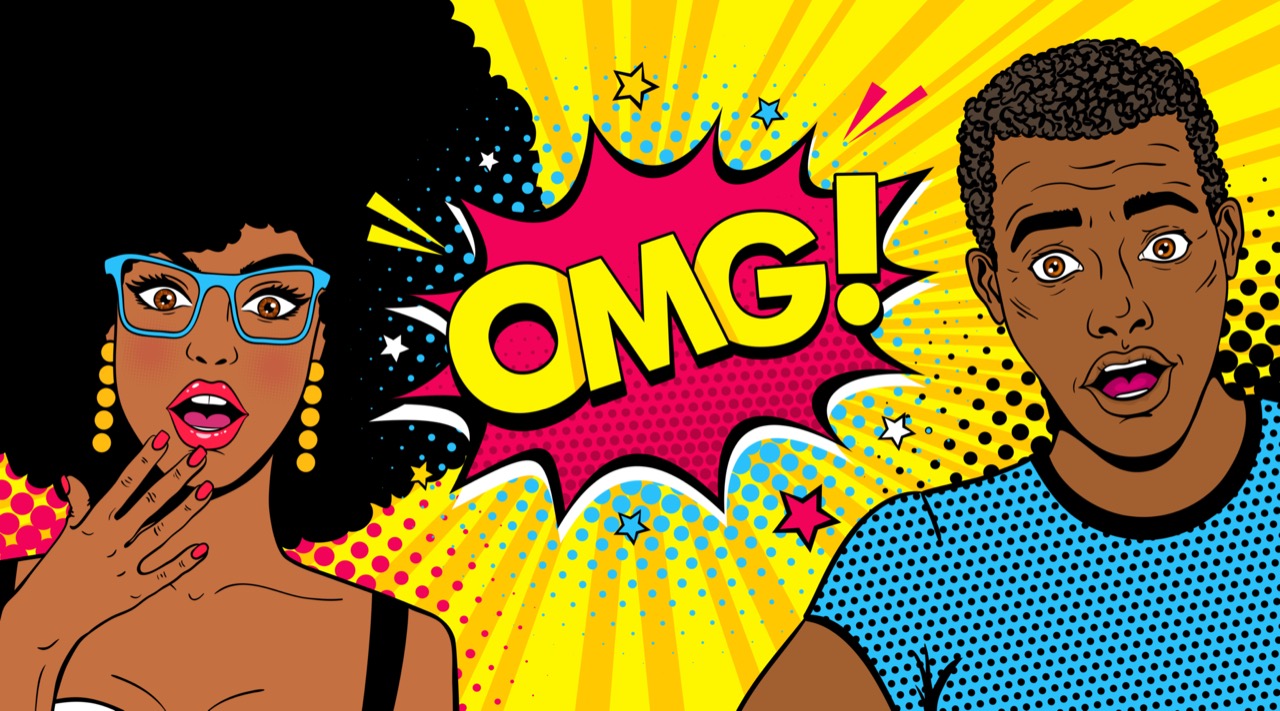
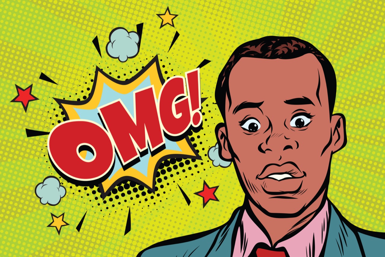
Pop Art’s punchy look also depended on editing. Artists often simplified backgrounds, boosted contrast, and isolated a single object the way an advertisement isolates a product. That reduction was a studio choice: remove what slows the eye down, keep what hits instantly. Even when the image came from something ordinary like a soup can or a tabloid photo, the transformation required planning: selecting the most iconic angle, refining outlines, and deciding what to repeat and what to vary.
The result is art that looks effortless but is built from a chain of practical decisions. Pop Art is not just about what you see, but about how you are seeing it: through the logic of printing, the speed of the studio, the influence of mass media, and the deliberate use of repetition, dots, screens, and even mistakes to make modern life feel both familiar and strangely new.