Candy Colors and Cool Irony Pop Art Quiz


Quiz Complete!
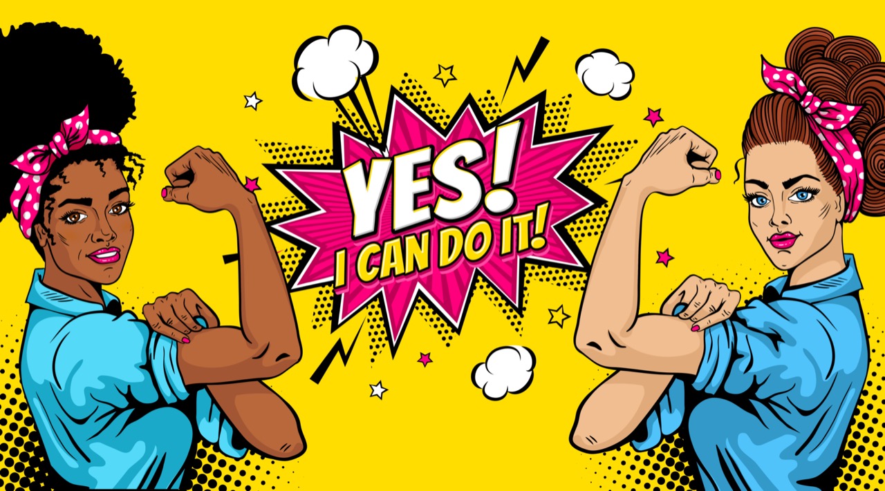
Candy Colors and Cool Irony: Why Pop Art Still Pops
Pop Art exploded in the mid 20th century with a simple, radical idea: the images of everyday life could be as powerful as traditional fine art. Instead of heroic myths or quiet landscapes, Pop artists pulled from supermarket shelves, comic strips, movie publicity shots, and glossy advertisements. The result was art that looked familiar at first glance, then started to feel strange, funny, or even unsettling once you noticed how it mirrored modern life back to you.
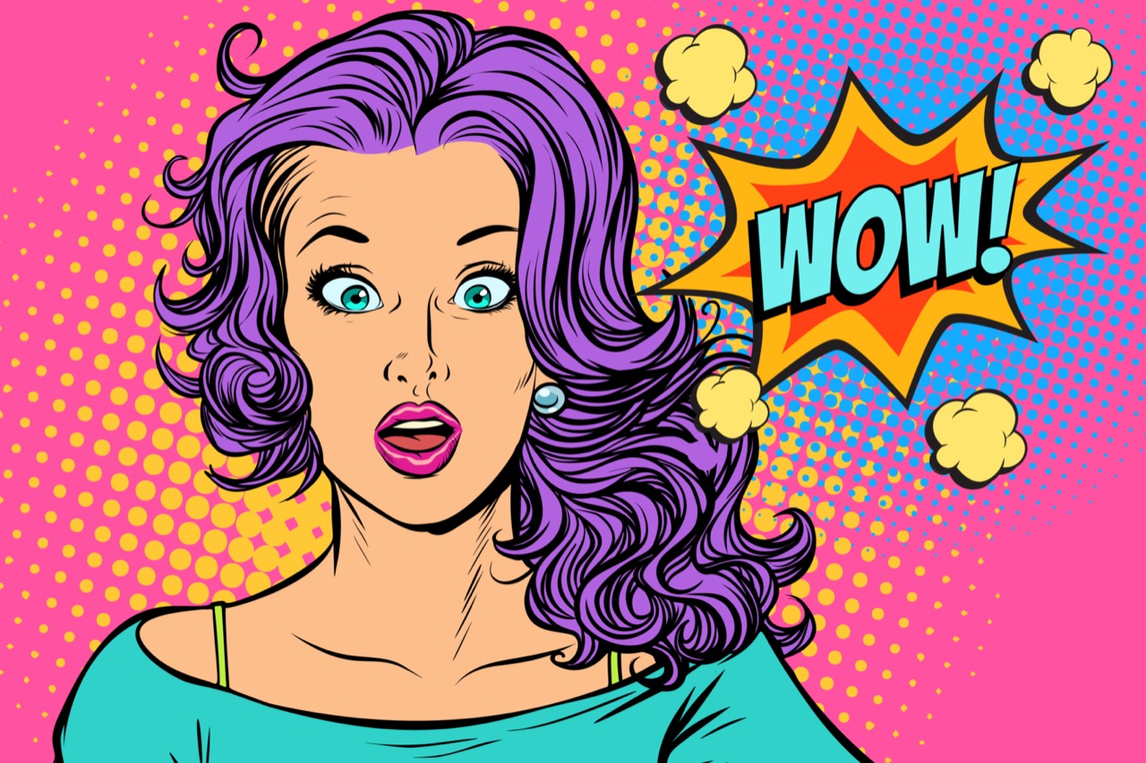
One reason Pop Art became instantly recognizable is its bold, graphic look. Artists borrowed the visual language of mass media because that was the common currency of the time. Roy Lichtenstein famously mimicked the dot patterns used in cheap comic printing, often called Ben-Day dots, turning melodramatic comic panels into monumental paintings. The dots, thick outlines, and flat blocks of color were not just stylistic flair. They highlighted how images were manufactured and how emotions could be packaged and sold.
Andy Warhol pushed that idea even further by adopting screenprinting, a technique associated with commercial production. His repeated portraits of Marilyn Monroe and his Campbell’s Soup Cans weren’t simply celebrity tributes or product praise. The repetition felt like advertising, but it also suggested how fame and consumer goods circulate endlessly, becoming icons through sheer exposure. Warhol’s studio was even nicknamed The Factory, a wink at industrial production and a statement about art as something that could be made, reproduced, and distributed like any other commodity.
Pop Art was never only American, though the U.S. became its most famous stage. In Britain, artists such as Richard Hamilton helped set the tone earlier, responding to postwar consumer culture with a mix of curiosity and critique. Across Pop Art, there is often a cool, ironic distance. The work can look like celebration and criticism at the same time, which is part of its lasting appeal. It asks you to decide whether you’re looking at a love letter to popular culture or a sharp commentary on it.
A key trick Pop Art uses is recontextualization: taking something you’ve seen a thousand times and placing it where you don’t expect it. A comic-book “Pow” becomes a museum piece. A detergent box becomes a painting. That shift changes how you read the image. You start noticing design choices, marketing tactics, and the way your own attention is guided. In that sense, Pop Art can feel like media literacy before the term existed.
Its influence is everywhere today. Social media feeds are built on repetition, branding, and instantly readable visuals, all Pop Art territory. Album covers, streetwear drops, sneaker collaborations, and even phone case designs regularly echo Pop colors, bold outlines, and punchy text. Contemporary artists and designers still use the Pop playbook to explore celebrity culture, consumer desire, and the blur between authenticity and performance.
If you want to spot Pop Art quickly, look for high-contrast color, simplified shapes, commercial printing effects, and imagery drawn from mass culture. Then look a second time for the twist: the way the work turns something ordinary into a question about what we value, what we buy, and what we worship. Pop Art never really went away because the world that created it never did. We still live inside a flood of images, and Pop Art remains one of the clearest mirrors we have for that bright, loud, endlessly fascinating reality.